Hi, I'm Prescott.
Systems thinker and brand-builder. Veteran art director/ designer embracing the power of workflow & discipline in creative teams. Proud oddball, recovering professor, lifelong geek. View selected past projects below.
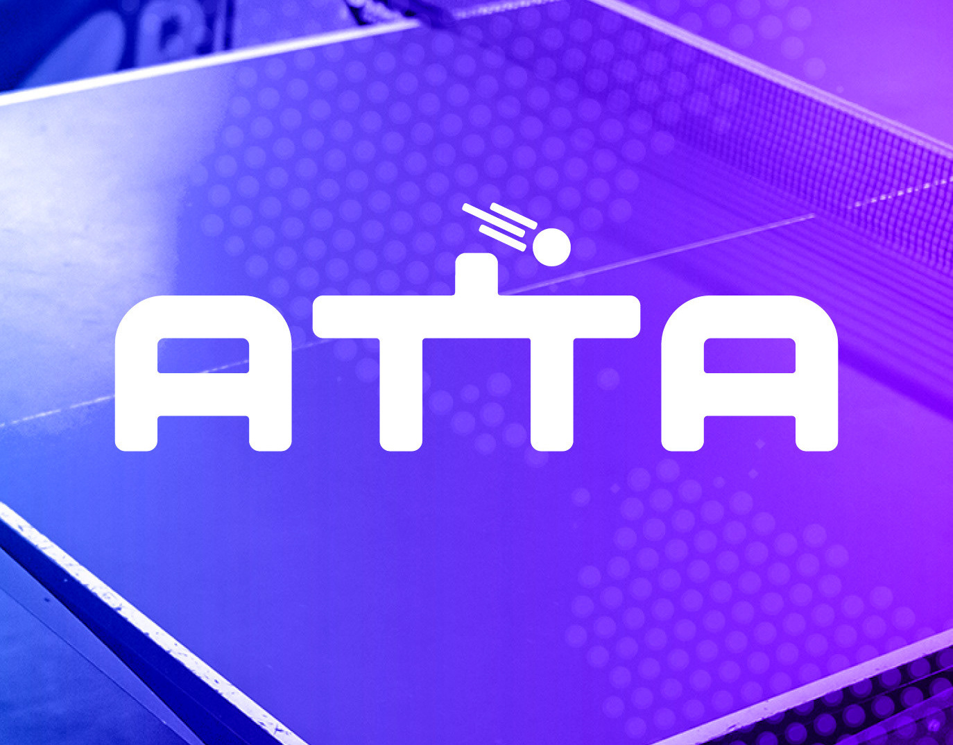
American Table Tennis Assoc. Brand Identity & Website
Photography, Branding, Web Design

Esparza Community Workshop Brand Identity & Website
Graphic Design, Web Design, Branding
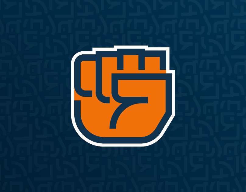
Empire State Indivisible Brand Identity
Graphic Design, Branding, Art Direction

The Busy Creator Brand Identity & Digital Design
Graphic Design, Branding, Web Design

Nexxus Identity & Packaging Update
Branding, Packaging, Graphic Design
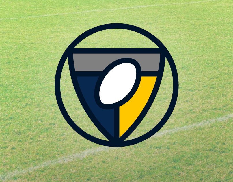
Drexel Rugby Alumni Association Brand Identity
Graphic Design, Illustration, Branding

PBS Catalyst Identity & On-Screen Look
Icon Design, Branding, Art Direction, Motion Graphics

Give a Latte Identity, Illustrations & Web Design
Illustration, Branding, Web Design
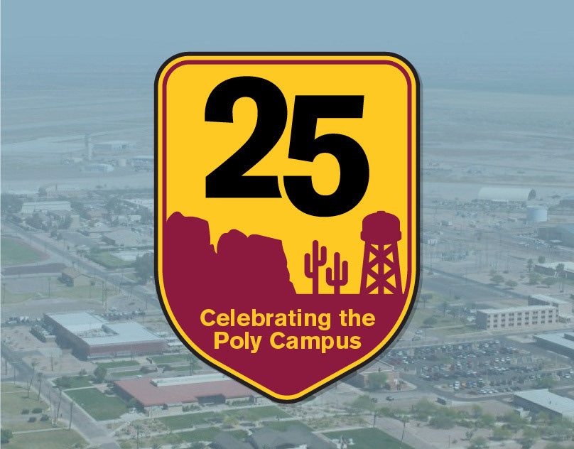
Polytechnic Campus 25 Year Celebration Logo
Graphic Design, Illustration, Branding
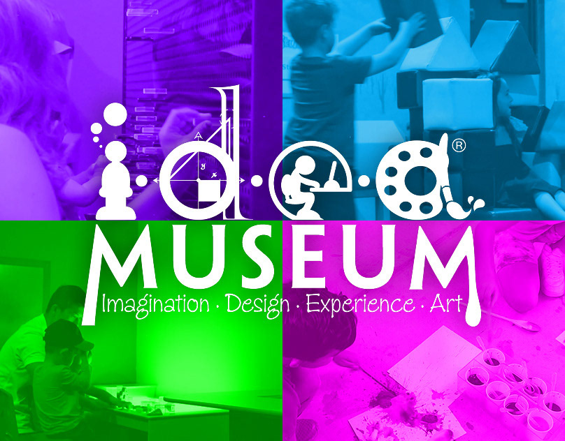
i.d.e.a. Museum Promotional Video
Motion Graphics, Film
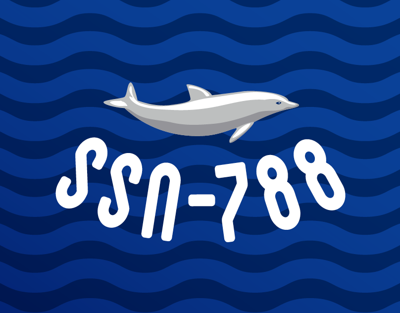
USS Colorado Crest & Logo System
Branding, Graphic Design, Illustration

Function1 Brand Identity
Branding, Graphic Design, Web Design

ChatWisdom Identity & Web Design
Branding, Graphic Design, Illustration, Web Design
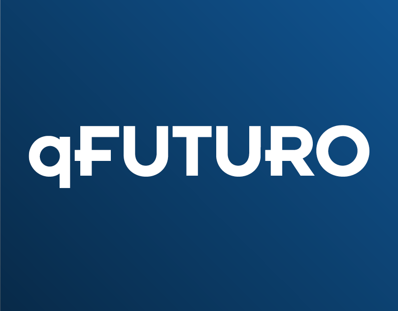
ɋFuturo Brand Identity
Branding, Graphic Design, Interaction Design